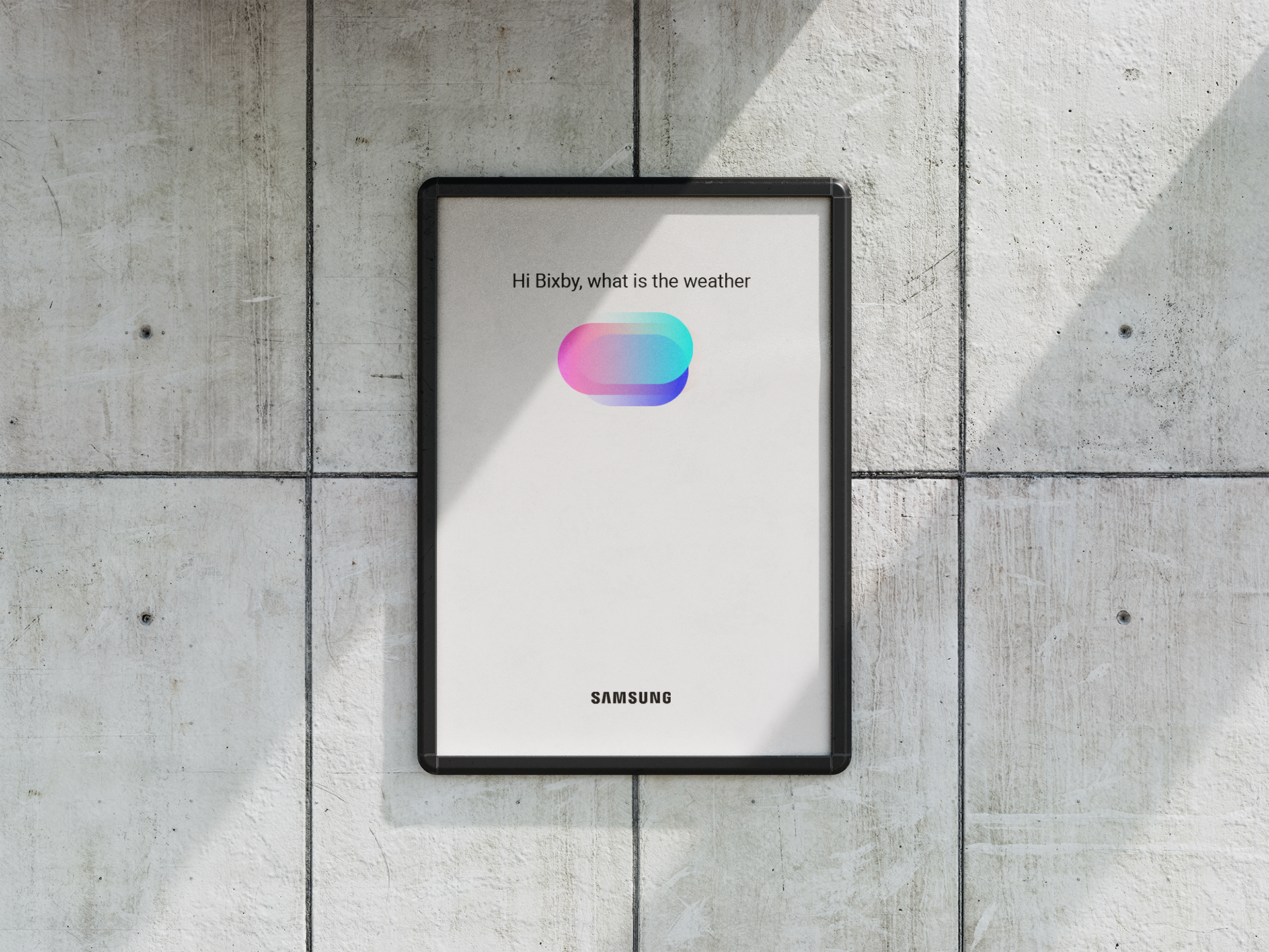
Redesigning Samsung AI visual indicator to help users understand different states.
Bixby is a virtual assistant that makes it easier to use any device, giving you more time to focus on what matters the most. Bixby learns, evolves and adapts to what you like to do, working alongside your favourite apps and services to help you get more done. Bixby will remember how you interact with it, to give you a more individualised experience. The more you use Bixby, the better it will become at adjusting to your needs.
Role: Motion Designer / Visual Designer
High Level goals
1. Improve usability of Bixby - Future proofed visual identity as a natural progression from the current identity and aligned with One UI. Visual identity is identifiable without logo and represents bixby person.
2. Strengthen Bixby's visual Identity - Clear visualisation of conversation states that are intuitive and natural, connecting the user to Bixby. Create an emotional connection through users through making conversations easier and more comfortable.
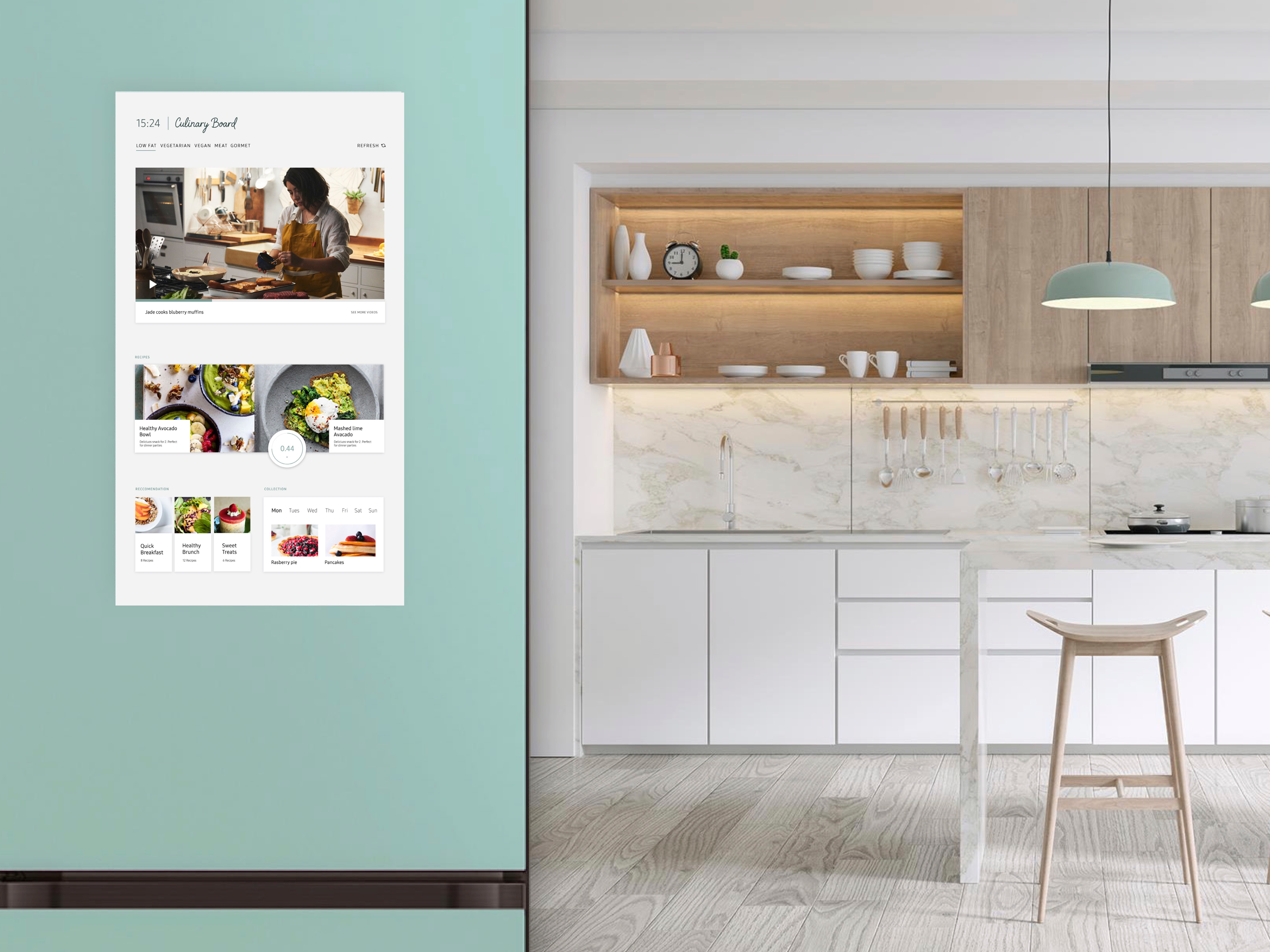
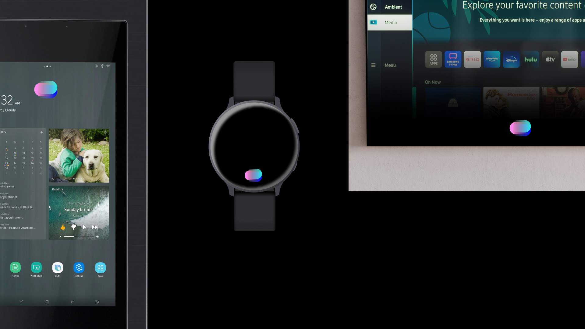
3. Scalable identity for diverse devices Visual identity and strategy to go across diverse products considering; no screen, small screen, large format, near/far view, dark/light view.
Problem:
User reactions indicated that people found that the look of Bixby was unintuitive and unnattractive. There was also an opportunity to rebrand the entire service and change its perception
Design:
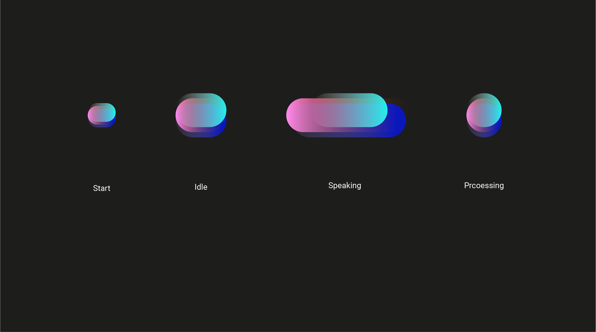
What might be an example of an iconic, indexical and symbolic sign for speech visual feedback?
How can the indicator scale across different devices? What if we create the indicator to visualise an increase or decrease in volume metaphor?
Research Methods:
I looked at a range of different aspects of research:
Samsung Products screen sizes and contexts
Current and competitive markets of indicators
Visual trends / Motion trends /Bixby designs
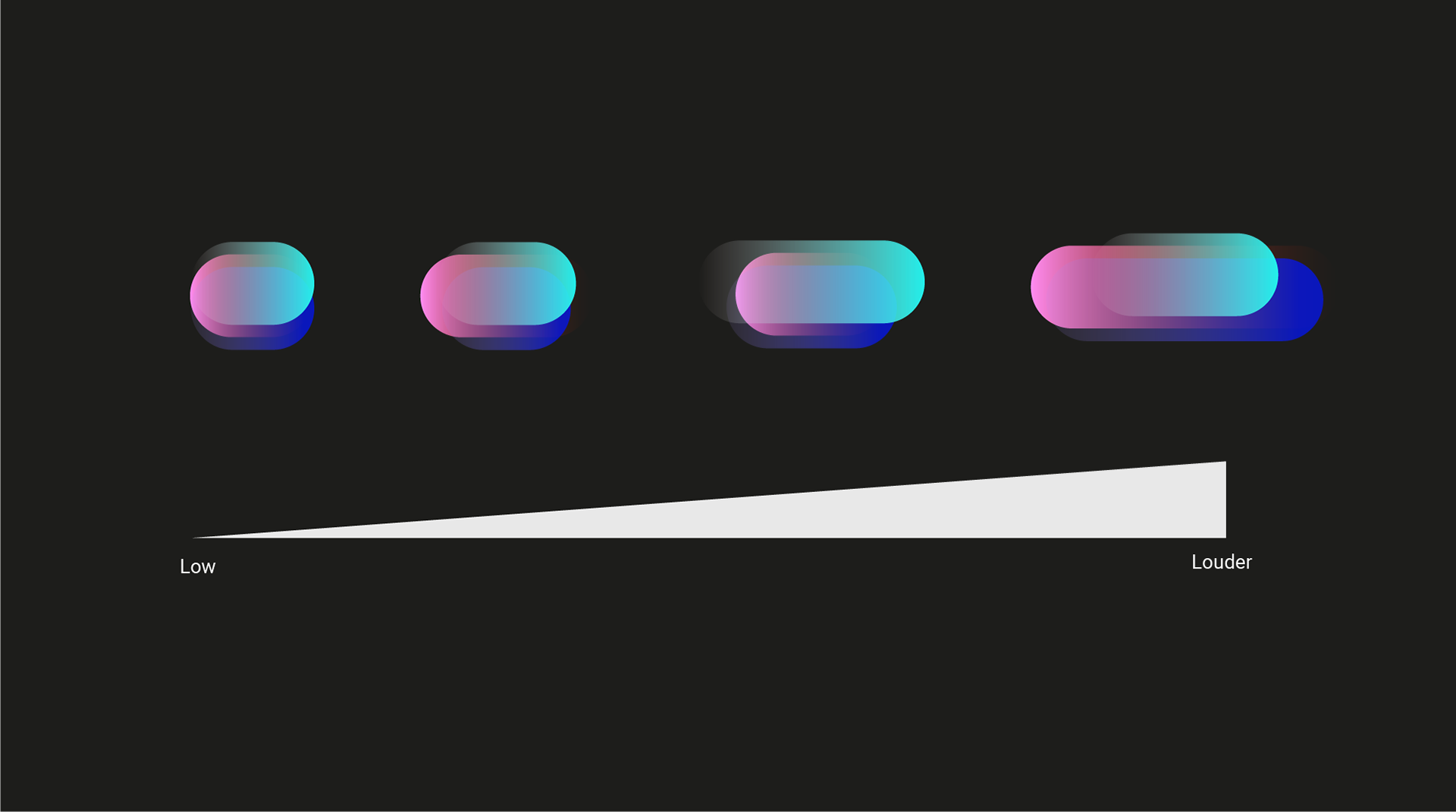
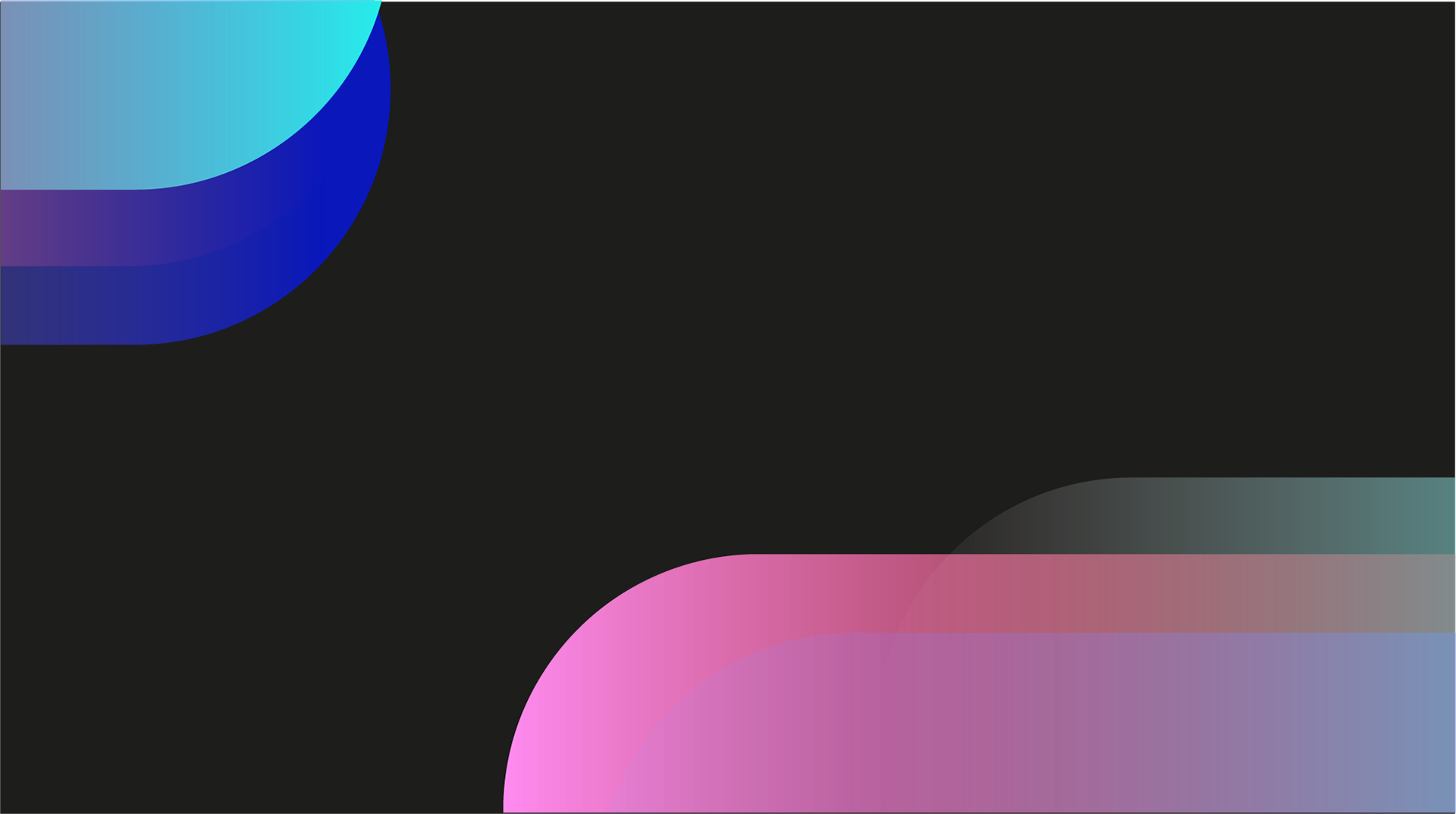
I created an idiom that projects a scalable volume system. I used 3 shapes to balance the volume structure. The centralization allows it to go on devices and non screen. We can stretch the shape. to an organic flowing form, it expresses its soothing and natural look and feel. Colours are improved to be more vibrant and inviting.
Structuring the motion flow
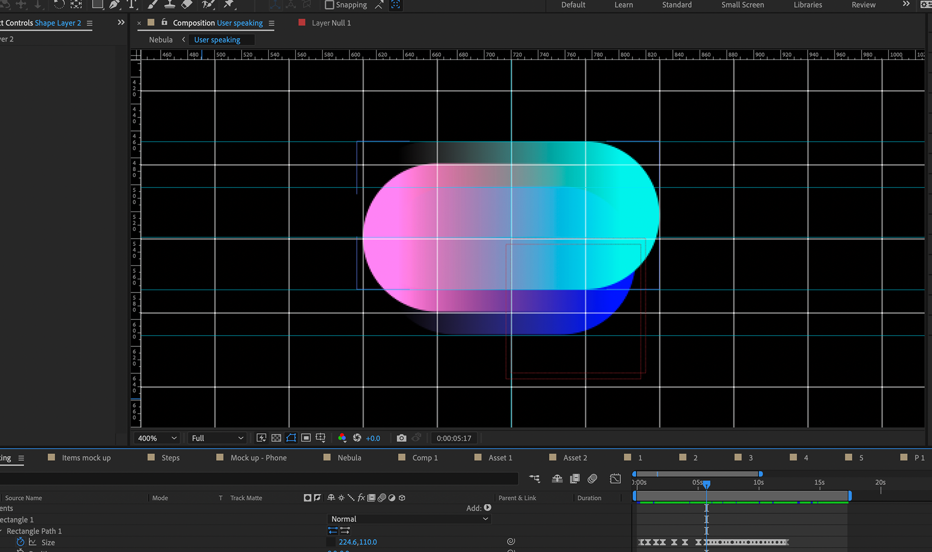
I used after effects to prototoype. It proved to be the best to craft the animation to the highest level.
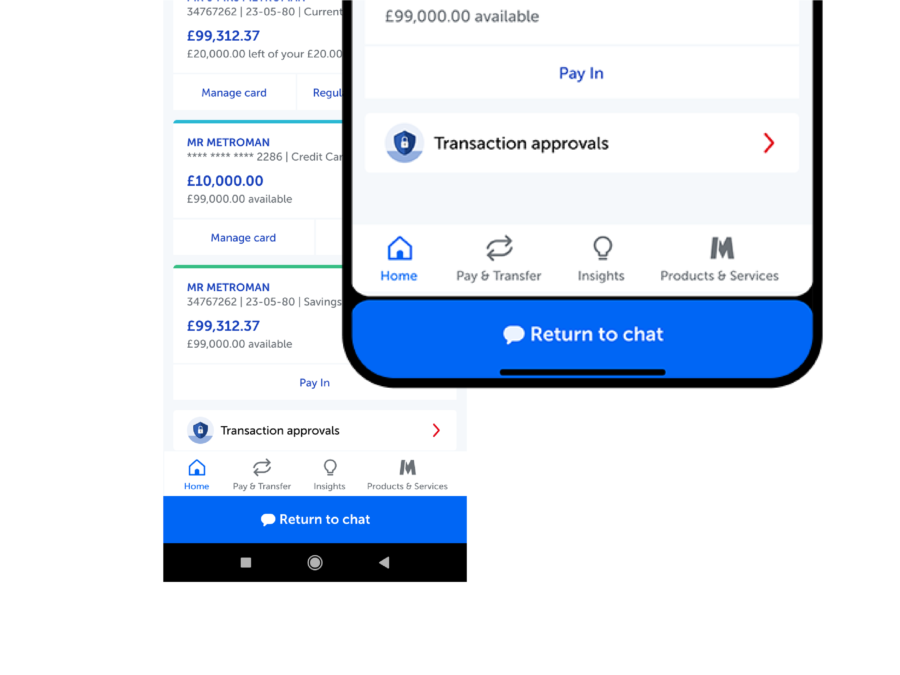
Visual UX that fits across different device ergonomics
Fridge, Watch, Tv Prototype