
Overview
Client: All-in-one HR platform
Project Duration: 6 months / 2023 till present
Role: Lead UI Designer
Project Duration: 6 months / 2023 till present
Role: Lead UI Designer
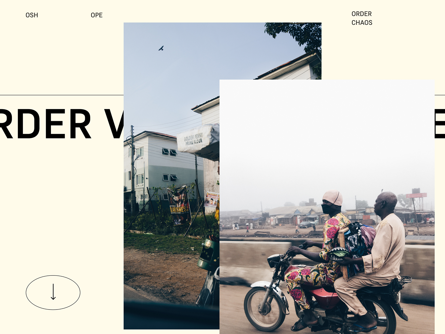
*Disclaimer - As this work is under NDA, I have scrubbed off the business name. This case study provides a structured overview of the design system exploratory & implementation process, highlighting the challenges, objectives, process steps, results, and lessons learned. It serves as a comprehensive document for showcasing the impact of the design system on HRco's product.
Business Challenge
HRCo, an aspiring HR webapp company, faces challenges with consistency and scalability in their digital products. With a growing portfolio, maintaining a cohesive user experience became increasingly challenging. The need for a design system arose to streamline the design and development process, enhance collaboration, and ensure a unified brand presence across all products.
"We want our designers and developers to access customisable components to speed their design workflow"
- HrCO.
Objectives
Consistency: Establish a consistent visual and interactive language across all digital products.
Efficiency: Improve design and development efficiency by providing reusable components and guidelines.
Scalability: Facilitate easy scaling of products by creating a modular and adaptable design system.
Collaboration: Foster collaboration between design sub teams and development teams
Process
1. Audit & Research
I conducted a thorough analysis of existing products of all-in-one platforms, identifying common design patterns, and assessing pain points in the current workflow. Gathered feedback from designers, developers, and product managers to understand their needs and challenges.
UX/UI Methodologies & Techniques:
- Specific component UX research
- UI design
- Style Guide
- Pattern library
- UX Audit - Used atomic design aproach. to build pattern library and components
2. Definition and Planning
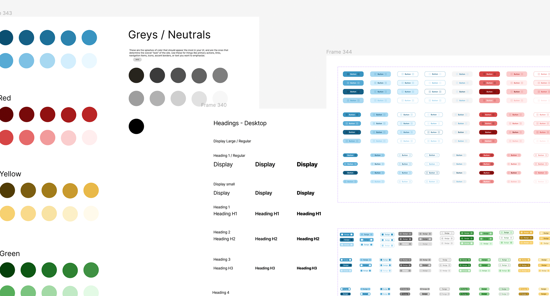
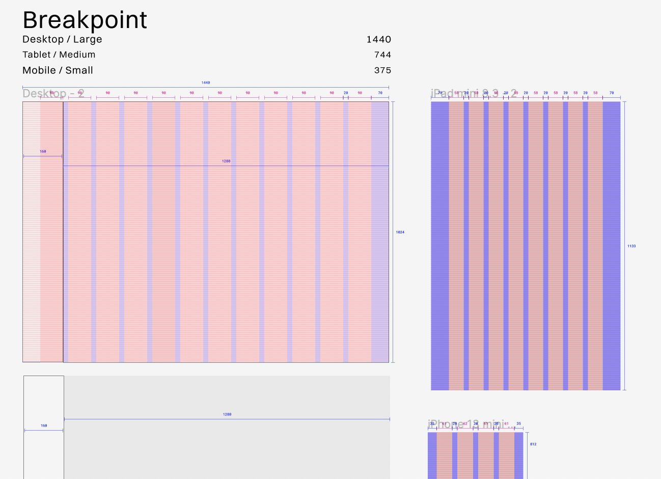
I outlined the key components and design principles that would form the foundation of the design system. Defined a set of UI components, typography, colour palette, and interaction patterns. Established guidelines for consistency and usage.
3. Design Exploration
Created initial design concepts and prototypes to showcase the potential look and feel of the design system. Gathered feedback from stakeholders and iteratively refined the designs based on their input.
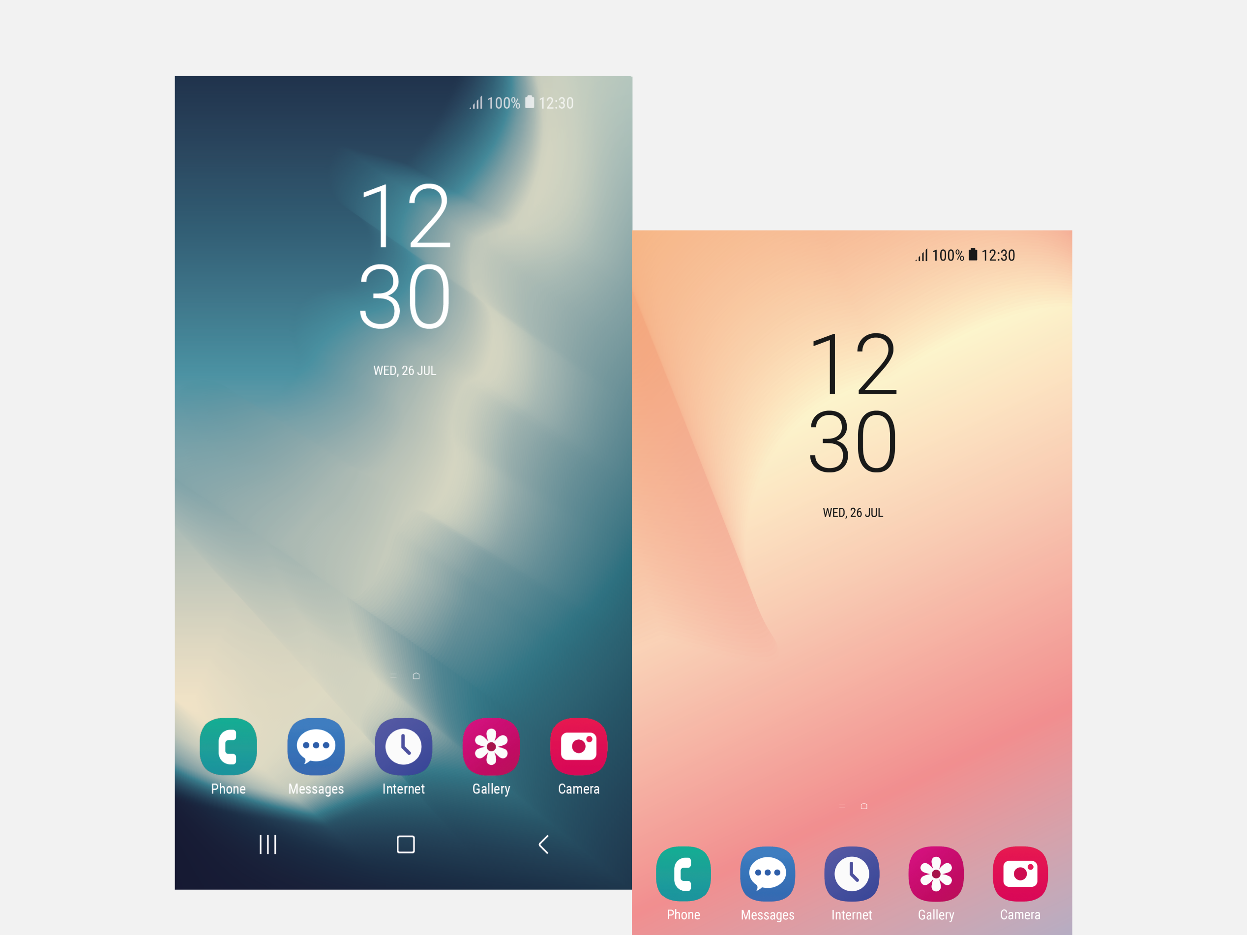
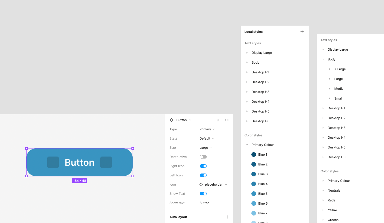
4. Component Library Development
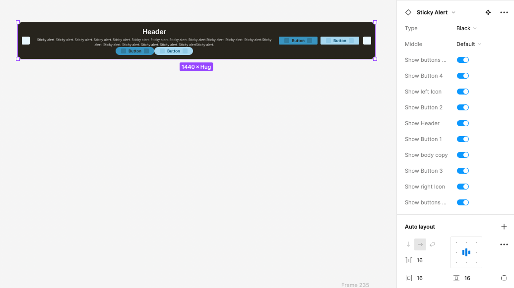
Established a comprehensive component library, including buttons, forms, navigation, typography, and other key elements. Ensured that each component was documented with usage guidelines, accessibility information, and code snippets.
- UI Inventory - Laid out each horizontally & started building atomic design aproach. to build pattern library and components

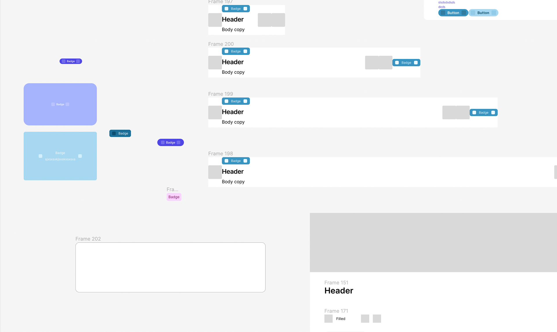
Example of nested components development
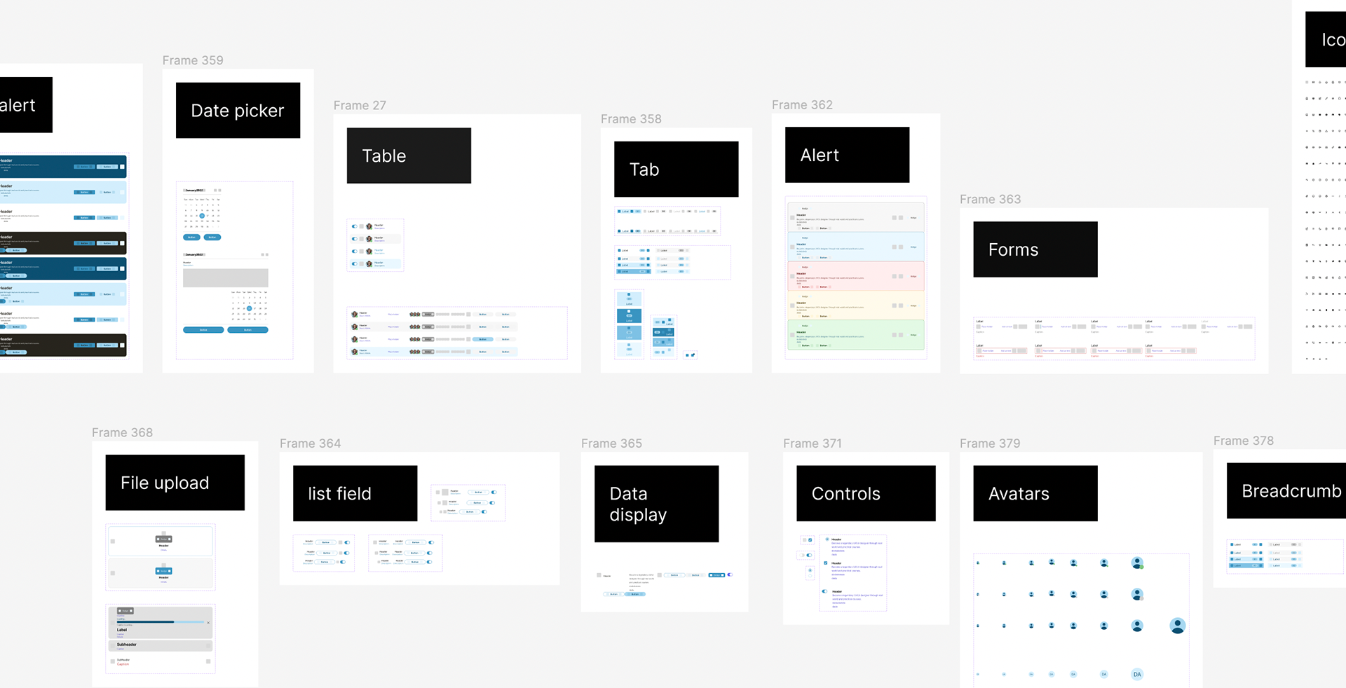
List of components development
5. Collaboration with Development Teams - QA of implementation - Correct labelling and building with auto layout
Collaborating closely with development teams to integrate the design system components into a codebase they prefer. Conducted showcase sessions to familiarise developers with the new designs.
6. User Testing and Iteration will be done by user researchers and will participate in note taking and supporting.
*Currently taking place
Will be conducting usability testing to validate the effectiveness of the design system components to gather feedback from end-users and internal teams, addressing any usability or accessibility issues.
Results so far
The first aim will be to refine the components and build key UI screens based on the feedback.
The second aim will be to fully commit to correct labelling and documentation.
The second aim will be to fully commit to correct labelling and documentation.
Consistency Achieved: A unified design language and visual identity established across all digital products and buy from dev team.